The Brick Roundabout That Solved a Junction
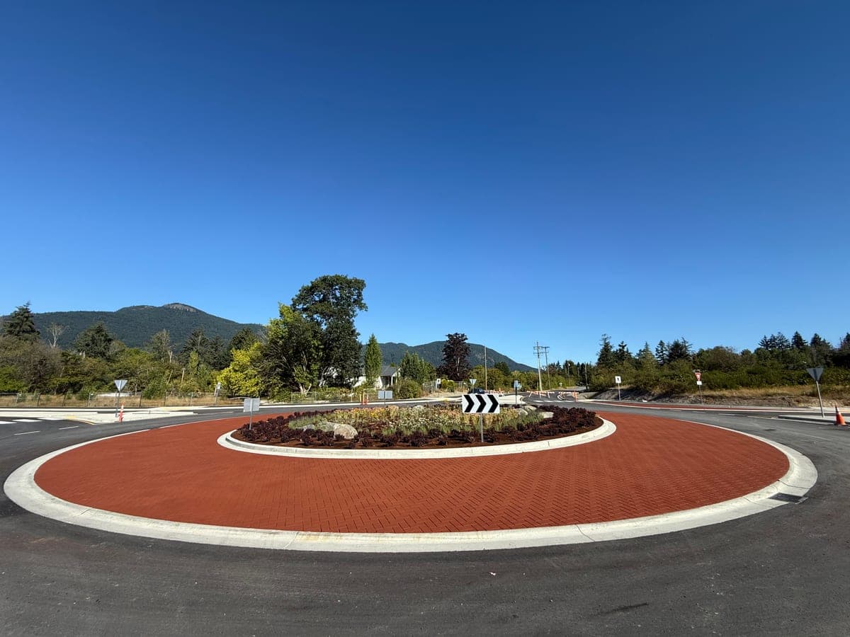
There is a junction on Vancouver Island that used to need three signs. A "Yield" sign for the inbound traffic. A "Pedestrian Crossing" sign for the foot traffic. A "Watch for Oncoming" warning for everyone else. Three signs, and drivers still misread the geometry.
Then we installed a brick.
Or, more accurately, we installed the appearance of brick — stamped into asphalt with a StreetPrint imprinting system, sealed in a deep terracotta colour, finished with a clean white border that rings the entire centre island. The transformation was done in a single weekend, no demolition, no road rebuild. The signs are still there. But the drivers don't need them anymore.
What happened
The colour and texture do something that signs cannot. They tell drivers, before language has time to register, that the road has changed. Asphalt becomes brick. Speed becomes attention. The visual cue is processed in the part of the brain that handles environment, not the part that handles instruction. By the time a driver has decided to slow down, they have already done it.
Traffic engineers have a term for this — self-explaining roads. Roads designed so the appropriate behaviour is obvious from the geometry and the surface alone. Brick roundabouts are perhaps the cleanest example. The texture announces "this is a yield zone" without anyone having to read a single word.
What we used
The roundabout surface is StreetPrint — a stamped-asphalt imprinting system. The asphalt is laid hot, the imprint mats are pressed in while it's still pliable, and the colour is applied as a heat-cured surface coating. The result is a textured surface that performs as well as plain asphalt under a snowplow blade and lasts as long as the road around it.
For the centre island, we worked with the engineering drawings to keep all crossing geometry MUTCD-compliant. The decorative treatment doesn't replace any safety markings — it amplifies them. The white perimeter you see in the photograph is high-friction, high-visibility coating, set against the deep red of the roundabout body so drivers register the boundary at a glance.
What it cost
A traditional roundabout rebuild — full curb work, drainage, paver installation — is a six-figure project that closes the road for weeks. Our installation reused the existing geometry and asphalt; the entire treatment was applied to the existing road in a long weekend. The municipality booked it on a Friday afternoon and reopened on Monday morning.
For the cost of the signage budget over the next five years, the road got something signs cannot give it: a surface that says, on its own, slow down here.
Why this matters for BC
Vancouver Island has a particular geography problem. Most municipalities are coastal, mountain-bordered, with corridors that funnel traffic through small junctions. The traditional fix is more signs, more lights, more lane paint. The colonial road-marking vocabulary.
Decorative pavement gives a different vocabulary. It lets the road itself communicate. And in a province where the views are this good, anything that quiets the visual noise of road infrastructure tends to be welcomed.
This roundabout was approved on a Tuesday. We were on site that Friday. By Monday morning, the corridor was different — and nobody had to read a thing.